Self-generated work / 2021 / figma, adobe illustrator, after effects
X-MEN APP DESIGN / In progress. Video depicting transitions, animation, and functionality still to come. This application is a conceptual design project intending to provide comparative analysis between various mutants in the X-Men Universe, property of Marvel Comics.

Intro loading screen / An intro loading screen design in gif form, showcasing the app branding and driving the focus to the search feature. The X-men logo is designed by the great Thomas Muller, and my modified version is only meant to fit a more rounded, softer aesthetic.

X-MEN APP DESIGN / PROCESS //
Focus group / I pulled three people close to me (for lack of access to a neutral party) and asked a series of questions on the topic of an X-Men app compiling appearances by character over the past 50+ years. After spending nearly 3 years with a market research company, I recognized the impact a focus group can have on a product, and have learned the keys to asking questions that both elicit useful responses and engage the group in both participation and interaciton. The following image is but a page of my notes as we riffed on the possibilities of this app.

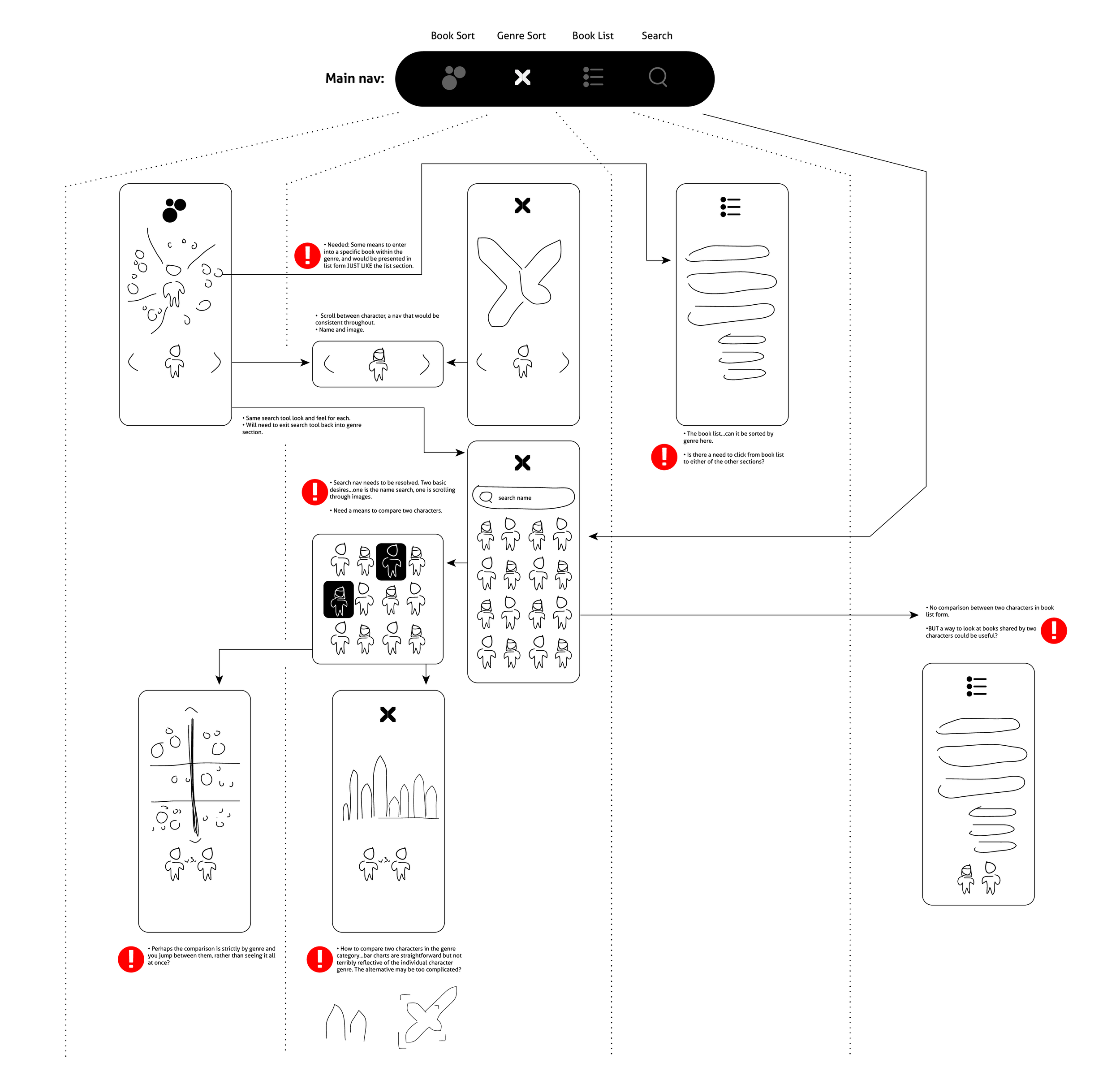
Early Lo-Fi Wireframing / After talking through my initial sketches with like-minded X-Men fans, I learned quite a bit about what was valuable about my initial data visualization explorations and what was not. This initial lo-fi attempt at a wireframe is very much incomplete (see red circles), and served to inform more hi-fi sketches and nav design.
Asset Creation / I’d created a few icons in the past that were helping to inform this project, so I revisited them and pulled them into the visualizations I created. Pulling data together for the biggest characters in the X-Books, I created an illustrative representation of each character’s publication history.


Navigation Design / The lo-fi wireframe informed these navigation explorations. My learning from the initial wireframe was how important it was to keep the amount of clicks to a minimum as there is so much potential overlap. I also realized just how much space was a luxury, and worked to keep the navigation from becoming clutter. Ultimately, I decided to hide the main nav to drive attention to the various means to approach content.
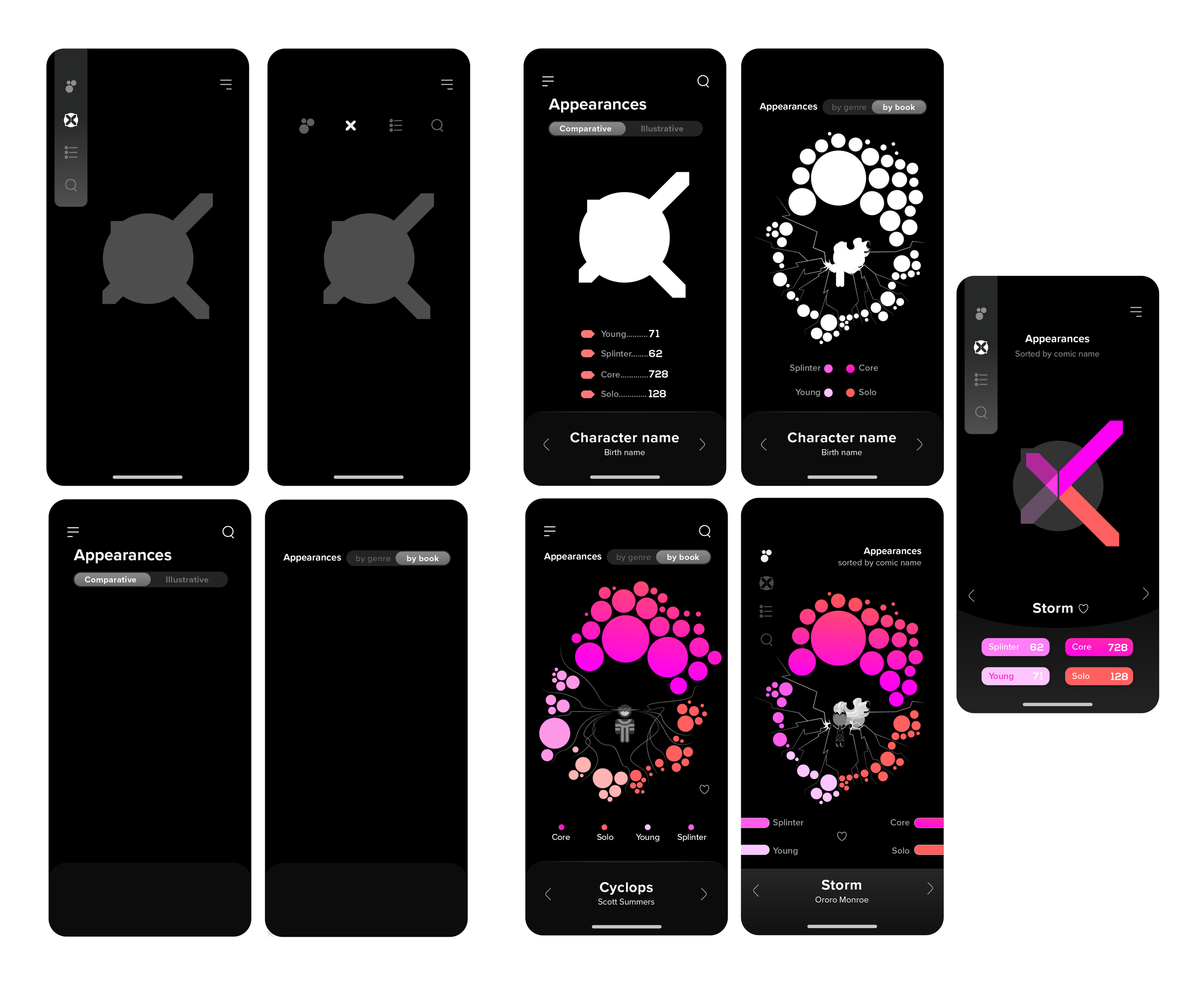
Wireframing / After these high-fidelity sketches, I pulled back to create a more detailed wireframe.