Graduate School Partnership with the Laboratory for Analytical Sciences (LAS) / 2021 / adobe after effects + illustrator + premiere + audition + miro
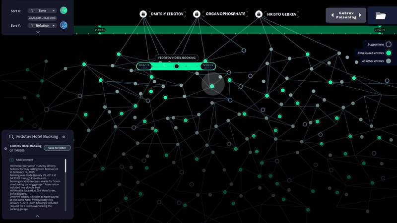
COREQUEST ANALYTICAL TOOL // Corequest is a program designed by myself, Lauren Bunham, and Molly Nunes for Helen Armstrong's GD572 Machine Learning class, a project conducted in collaboration with the Laboratory of Analytical Sciences (LAS) at North Carolina State University. Assigned a specific case study, Tracy, an experienced analyst with a standard way of working and an expertise in linguistics, our team created a site intended to facilitate discovery in a way that made the tool invaluable regardless of Tracy's reluctance to change. The following is a scenario video showcasing a specific path through our desktop program, emphasizing the features of the application and their advantages over current methods of conducting investigations. After the video, please note the process steps that highlight our partnership and diligence in pursuing an effective solution.

COREQUEST ANALYTICAL TOOL / PROCESS //
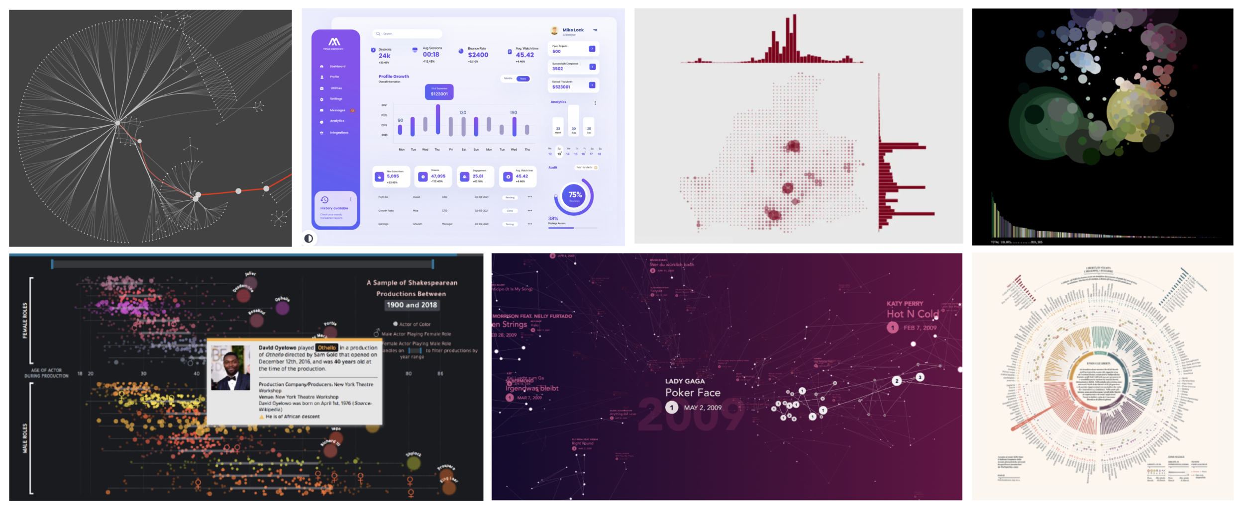
Concept Finding / Each member of the team looked for data visualization and information-compiling visuals that inspired us, particularly as means to reduce complicated concepts to digestible bits of information. We used these moodboards to inspire our initial explorations.
User Journey Map / Here you see our presumed user journey map for Tracy. As none of us were familiar at the time with the work of an analyst, we used what we knew and were learning, and some base assumptions. This user journey map would serve as the crux of an interview coming at the next stage in our process. Here, you can see where that user journey map fit into our workflow over the course of the month we worked on this project. Using Miro, Lauren, Molly, and I were diligent in recording our learnings, sharing our explorations, and laddering up with each conversation.
Conducted Interviews / Using the user journey map as the focal point of our interview, we interviewed three people in a similar role to our muse, Tracy, and plotted our learnings along how relevant they are to our project. This activity focused our attention.
30-minute Sketches / Our team spent 30 minutes sketching initial ideas for how a new interface might look.
Follow-up Sketches / After consolidating our concepts and building on each other’s ideas, Lauren, Molly, and I spent an evening apart, sketching more concrete concepts/directions to present to the team at the Laboratory of Analytical Sciences (LAS) as well as the rest of the class. LAS’s feedback was invaluable in seeing what concepts had the most merit and feasibility My more 3-dimensional concepts generated quite a bit of conversation, and elements from all of our team ideas built towards our ultimate direction.
High-Fidelity Iteration / The previous draft of sketches positioned our team to hone in on an idea that would best meet the needs of analysts. Given that, we each took one of our most successful, well-received ideas and pushed it further in a high-fidelity direction. I pushed a 3-dimensional concept further, prior to our next conversation with LAS, and numerous elements of this iteration made their way into our final concept. These elements include the sorting that happens at the beginning to hone the knowledge graph, the grouping of like entities, and the filtering options to reduce timeframe and location (amongst others). We then, as a team, had numerous sessions to discuss combining the strongest elements of our ideas to create the video above.
FINAL User Journey Map / Our user journey map for Tracy’s experience evolved as our application came into focus. We followed a specific phase-by-phase walkthrough for the sake of explaining what, in reality, is quite the complex application with too many key features to list.

Intro Materials / In our final presentation, we showcased the functionality of our desktop app by following our case study. I designed and animated the loading screen, the adding of elements to the knowledge graph, and designed the timeline view. I also used Adobe Premiere and After Effects to sync the entirety of our video to the voiceover, animated the knowledge graph exploration section (the knowledge graph prior to the timeline), inserted the mouseover effect throughout, and designed and animated the outro. Most importantly, I focused heavily on serving as a leader in our group, amplifying voices, driving discussion, setting incremental goals, and keeping spirits up. I approach leadership roles as an opportunity to gently guide and encourage self-reliance and self-belief. When a leader oversteps and dictates, then cohesion and synergy are sacrificed.


Timeline Sort / I designed and animated the focusing of the timeline to a tighter range, allowing for the knowledge graph to be be more navigable. This section was the highlight and payoff of our desktop app, and is where we truly showcased the knowledge graph in a way that was finally explorable.